We took a day's hike at Duke Farms, learning about butterflies and moths and flora or all kind, especially native caterpillar food plants. On the walk back to the orientation center I stopped at the little waterfall at Duke's Brook to paint. I have been wanting to find local places to paint, and this 2,700 acre estate and park is right in my backyard. This little waterfall is one of the signature locations in the Farm. Normally, there is water generally cascading down the darker rocks, but now in the mid-Fall there was no water. I think this is a place I need to go back and paint when there is snow on the ground and then again in the Spring.
Watercolor on paper 5.5x8.25
I am starting to become comfortable with new paints and the Pocket Palette (and its smaller size). I love smooth washes and the ability to layer color. What I like most about this travel catch, it is a much different color palette than my other previous works.
Well, this one. . .I am excited about. Using the Daniel Smith paints has certainly been eye opening. I was able to do a light under wash and then layer color on top once the first wash dried (much like I do with pastels). The result is so much closer to what I have been attemping to achieve. The horse was masked using liquid latex and painted with a rigger brush.
I still used the Pocket Palette (ie dried paints) and even though it is fun to use, I will try using fresh out of the tube paint on subsequent paintings now that I just bought a porcelain butcher's tray (ie, palette).
Watercolor on 200lbs paper 10x14
So, I have been accused of painting three legged horses. And well. . .
I really did not have a plan for the sky, or more specifically the pink clouds with their touches of darkness within, they just kind of happened. Not sure how I feel about that. The foreground with touched up with a hint of Unison pastels to bring out the highlights in the grass.
Watercolor on paper 10x7
I do not normally use the back of paper (I am just weird that way) but I have seen so many sketch crawlers do these amazing double page spreads. It has been something I have been considering for awhile. Plus, what drew me to the tree was the fact that it was the only tree in the well manicured valley in the park. As I started to draw it on the single page, it just looked too crowded on the page (defeating the purpose for painting it in the first place), so I kept drawing on the other page. I am quite pleased with the final result.
watercolor on paper 5.5 x 16.50
The Daniel Smith paints continue to be enjoyable. The colors seem brighter than the cotman and the washes are easier to manage.
My kit: Pocket Pallette, niji water brush, 1/2 inch brush, spray bottle
The entrance to the walking path at Natirar County Park, you can see the tree I painted off to the right. It was just a perfect day for sitting outside and painting.
The end of an era. . .the times they are a changin'. . .and sun also sets. . .
Watercolor on 140lbs paper 10x7
Holy Shnikes!! I finally broke down and bought "artist grade" watercolor paints. . .and what a difference they make. I had been unable to create the type of washes I have seen in other paintings since my cotman paints always seemed to dry up too fast (they are not pure pigment and have too many binders). These new paints were amazing.
Sunday I went outside and did a quick painting based on a photo references and I was really impressed with the results. Sorry cotman, I think you have just been retired.
Watercolor on 140lbs paper 9x12
After much research (hey, it is what I do), I decided to buy Daniel Smith paints (M Graham was my second choice). I also bought another travel kit for the new paints. It is called the Pocket Palette and it is about the same size as a business card holder.
Here are the colors once they dried in the pans (pretty cool looking). The Pocket Palette holds 14 colors but I bought 15 (8 came in a set). It is a good set of warms and cools, plus a few mixes like sap green and moonglow because. . .well. . .because I like them.
I probably should have used a bigger brush. However, I wanted to be outside painting rather than in my studio, so I had my cotman travel set and the niji waterbrushes, not the larger flat brushes. The cool shadows below the tree did not turn out the way I intended, but I think the final effect was quite pleasing.
Watercolor on 120lbs paper 9x12
This is the first painting with my modified cotman set. I finally, after much internal debating, swapped out some of the pan colors that came with set (that I do not use) for other student grade paints. I say student grade because I have made the leap (finally) to more expensive artist grade watercolor paints. They should arrive in a week. I will use them both in the studio and as my new, customizable travel Pocket Palette. I can hardly wait.
There is a special kind of light in the waning days of the summer that tantalizes us with whispers of longer days now past. It can make us pause as the light captures our attention and freezes a sleepy image in our mind. And there is something about farms and rolling hills that I associate with this summer light.
Watercolor on 140lbs paper 9x12
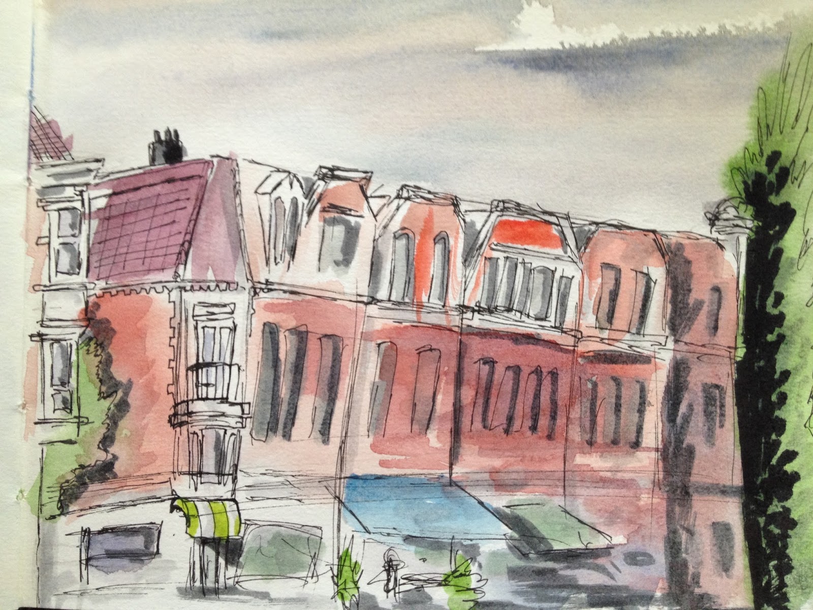
The trip was busy, as work trips often are, so I was only able to get one sketch done during my trip to Amsterdam. Sitting just out front the little boutique-y hotel on Eerste Constantijn Hugyensstraat (say that five times fast to your favorite Dutch cab driver and just wait for the blank look. . .then show him the address on your phone), I was able to capture the shops across the street. My intent was to also draw the little park just to the left of these buildings. Alas, there was not time.
Architectural drawings are not my strong suit and I did some touch ups later that night after dinner to provide more contrast. Not bad over all, and it was just fun to sit and draw in the same city as Van Gogh.
Watercolor and ink on paper 5.5x8.25
It was a perfect day; 81 degrees F with no humidity. We packed a lunch, went for a long bike ride and picnicked in a flower garden. There are several flower gardens in Colonial Park and we chose an often forgotten side garden. And while my better half read (aka napped in the sun), I did two small paintings. I bought three small travel books a while back, I took one to Colorado but decided to try a new one for today (because nothing is more fun than using new art supplies).
These paintings also mark the beginning of me customizing my half pan set. I swapped out a little used brown for Payne's Grey. I have been wanting to incorporate more darks into my travel paintings.
Watercolor and ink on paper 5.5x5.5
Watercolor and ink on paper 5.5x5.5
This one had to wait before I posted it since I included in a work PowerPoint presentation. It is a cartoon of my boss' boss (who used to be my boss) and his favorite summative statement is ". . .at the end of the day." So much so that it has become a running joke between us (not that I made him paranoid about overusing it or nothing, I would never do that).
Watercolor on 140lbs paper
This also gave me an opportunity to do some good ol' fashion cartooning. Back in the day, I used to do this all the time for class presentations and in the margins of my class notebooks. Good stuff.
Sometimes you have to be prepared to ruin perfectly good paper. It allows for greater freedom. And while I did not exactly ruin this one, I am not sure if I hit the mark with it either. Still, I am quite happy with some of the layered washes and will put this one in the "win" column.
Watercolor on 140lbs paper 9x12
The old wheel barrel sits in our side yard next to our neighbors' arbor vitae. In certain light, it reminds me of an old country side in Europe. I decided that the other houses from the development did not need to be included in this sketch. Combined with the shed and the butterfly bush, I have now painting all of the most interesting elements of our yard.
Watercolor on paper 10x7
This painting also marks the 12th and final sketch/painting in the pad I bought almost one year ago. As I have mentioned before, I have never filled every page of a sketch book, pad or journal and therefore I challenged myself to do complete one in a year time. I think I have 3 days to spare. It is also the 29th painting of the year, making 2013 my most product of this blog. Very cool.
What was also fun about painting today was my niece joined me and she did two drawings of her own. I think she was excited about using the same watercolor pan set as me.
We have tried to kill our butterfly bush. Several times. . .but never on purpose. We have hacked away the dead branches until it was back to a nub and thought, "yeah, this time we killed it for sure." And it always springs back and goes all crazy like a bad perm on a humid day. It is as resilient as Rasputin.
Watercolor on paper 10x7
The butterfly bush is the center of our backyard and since we have planted a "squirrel proof" bird feeder, it is the center of all bird activity. I enjoy watching the cardinals, chickadees, finches and morning doves as they feed throughout the day. They are a nice respite during a hectic work day.
This is 11th drawing in the oft mentioned pad bought in Chicago. I had considered this subject for the 12th and final drawing. However, for what ever reason this, this image has been front and foremost in my brain for awhile, demanding my attention. It was almost as if this painting needed to escape my psyche.
It is also my 28th drawing of the year, tying it with 2005 as my most productive year.
This has sat on my drawing board for a week and I thought it was time to post it. I have been waffling back and forth about whether to lay some watercolor down on this. I think it might be cool to add a hazy watercolor wash to the background to counterpoint the white and grey of the ram. Still not sure. Since I may yet painting it, I left the pencil under drawing un-erased. Leave a comment and tell me your preference.
Pen and ink on 140lbs paper 9x12
The Dall sheep, Ovis dalli, is a species of sheep native to northwestern North America. I flirted with the idea of mislabeling him "goat" because that seems to elicit comments.
This drawing is from a photo taken in Denali national park, Alaska like this painting of Mt McKinley. Alas, I have never been there but hope to one day.
Today was our town's 100th anniversary and it started it off with a big (relatively speaking) parade. Luckily, with the early start it was only in the mid 80's (it would hit the upper 90's later in the afternoon). While waiting for the parade to begin I decided to paint the people setting up their chairs and umbrellas.
Watercolor on paper 9x7
This is the 10th painting in the pad I bought last August in Chicago. I gave myself a year to fill its 12 pages with paintings and complete a book for the first time in decades. I have a month and a half to get it done.
Why an exclamation point? Why not? Besides, turtles are cool.
Pen & Ink, Watercolor on 100lbs Bristol 11x14
If I am anything, I consider myself an illustrator, or in the 'Jersey vernacular. . .a drawer (pronounced draw-RER). Drawing or sketching is how I got started in all this and it is always my first love. I may never master watercolors as fine art, but I do love the way the augment my illustrations.
Pen & Ink
Whilst on vacation, I set a a personal goal to do one sketch each day. As it turns out, I successfully carried my travel sketch kit with me on each of the 6 hikes we did on Colorado. Here they are.
On our first day in Colorado we attended the Renaissance Fair in Larkspur. The Fair was similar to the one in Tuxedo New York that we usually attend but the end battle/joust was much shorter. I quickly drew this while sitting on the lawn waiting for the main even joust to start. There was no preliminary melee and so I missed the entire joust while sketching.
Waiting for the Joust
Watercolor and ink on paper 5.5x8.25
The hike to the top of Mount Herman was a little over a mile in distance (we stared toward the top) but took us from ~7700 ft in elevation to 9100 ft. Between the elevation and the steep climb, I was hurting a bit after this one. And this was not the toughest hike. Literally two minutes after I finished this, and while I was still packing up, rain clouds swooped in and obscured the view of these mountains.
The View from Mount Herman
Watercolor and ink on paper 5.5x8.25
The Garden of the Gods was by the far the easiest of the hikes and perhaps the most inspiring. We took tons of photos that may one day find themselves the subjects of their own paintings. I painted this sitting on the sunbathed observation deck of the visitor's center and may be my favorite sketch of the trip. Cathedral Rock, or Grey Rock, is one of the first rock formation you see when entering the park.
Cathedral Rock, Garden of the Gods
Watercolor and ink on paper 5.5x8.25
I rushed this one a bit and it shows but the biting flies were. . .well. . .biting. I do like how the water preceding the little waterfalls came out. That said, everything about Estes Park was just amazing and beautiful. I think my next vacation to Colorado needs to include many more days exploring this park (and hopefully next time I will get to see an Elk in the road).
The Pool at the Big Thompson River
Watercolor and ink on paper 5.5x8.25
Horsetooth Mountain was supposed to be a "moderately" difficult hike. Yeah, right. We called it 10k the hard way (3.1 miles to the top) and this one kicked my @$$! This hike included rock hewn stairs, scrambling and steep grades. . .but man, was the view worth it. I chose to paint the western view instead of the eastern view that included the city of Ft Collins. I just did not want to paint any buildings on this trip.
Western View from the top of Horsetooth Mountain
Watercolor and ink on paper 5.5x8.25
The final hike and sketch was from Seven Falls, a truly beautiful sight of seven cascading waterfalls. Instead of painting the falls themselves, I instead chose to paint the view from Inspiration Point. This sight is the final resting place of Helen Hunt Jackson and was the inspiration for her novel Ramona.
Inspiration Point, Seven Falls
Watercolor and ink on paper 5.5x8.25
The rare landscape painting done in portrait mode. I felt the height of the sky was the most important design element and so I flipped the paper thusly. A friend sent me the view from her backyard and I felt inspired to paint it. The sky in the photo had more pinks than purples, but purple was where my mind was at. I also omitted the palm trees on the side of the painting. I thought about going all Bob Ross and doing a dark tree up the left side, but I just could not. I think it would have distracted from the sky.
Watercolor on 200lbs paper 14x10
I think I need a vacation. . .someplace with sunsets like this.
Watercolor on 200lbs paper 12x16
This is the largest watercolor I have ever done. I stood while painting and was very loose and free with the strokes. I think I futz too much with the sky but otherwise, I am rather happy with results.
And historically speaking. . .this marks my 22nd post of the year and the 200th over all. 2013 has now tied my third most product year since I started this blog in 2006. I doubt that I will ever match the first year (101), where I was posting pictures from a 10-20 year period.
I bought a bunch of small travel art journals awhile back but have yet to use them. I have taken them on several business trips but never had the time or the right mindset to use them. I wanted to paint today but did not feel like doing anything large or ambitious. This little landscape book hit the spot.
Watercolor and ink on paper 5.5x8.25
This took about 15 minutes to draw and paint. . .and was fun too. I look forward to filling up this book and its smaller cousins.
And here is the rough drawing in ink.
I must admit, after the first Wolverine movie, I did not have high hopes for the current sequel. After seeing the first two full length trailers. . .I am starting to getting (guardedly) optimistic. Since it is partly based-on the immensely popular Chris Claremont/Frank Miller limited series, fans are going to have high standards for this movie. But Wolverine. . .fighting ninjas. . .how bad can it be?
Watercolor and ink on 140lbs paper 9x12
This watercolor and ink is based on the cover of the current Entertainment Weekly. My goal for this was to do something Barry Winsor-Smith-esque. I love his inks and watercolors. This was not bad, but I still have a long way to go to making the washes more subtle. Aside from his face (which is too dark), I am happy with this piece.
I used my new Faber-Castell TK 4600 mechanical pencil and Faber-Castell pitt pens instead of my usual Sakura pigma micron pens. They are very nice. I think I might like them better ::gasp:: than the micron pens.
Rough Pencils
Loose inks.
The goopy stuff on his claws is liquid masque. I wanted to make sure his claws were shiny.
Done entirely with only the Hake brushes. . .that is right. . .no flat or round or rigger brushes. . .Just the Hake, ma'am.
Watercolor on 200lbs paper 10x14
The two things that I am learning about Hake, and both relate to the fact that they hold lots of water (as advertised). First, is the amount of water you start with is the secret to doing light washes as an under painting. Second, to go effectively go over those light washes, you cannot be afraid to use lots of paint. Initially, I was only using the paint sparingly and I need to stop doing that.
I am still need work mastering the Hake brushes. . .that much is obvious. And I am struggling with creating the wispy atmospheric feel that light washes of watercolor can produce. That said, I consider this to be more of a success than failure.
Watercolor on 120lbs paper 9x12
Just because it feels like it is. . .
Watercolor on 200lbs paper 10x14
Completed using only Hake brushes (except for the two fishermen in the boat). This may very well be my favorite sky. Someone challenged me to work lighter and use more sensitivity with my brush work. I think I am getting better.
The area of Bound Brook was first settled in 1681. It was incorporated as a town in 1869 then reincorporated as a borough in 1891. It is most famous for the Battle of Bound Brook (American Revolutionary War) which occurred April 13, 1777. Reenactments of the battle between the troops of Lt General Lord Charles Cornwallis and Major General Benjamin Lincoln still occur every year (last year I got caught in the "battle" and had to wait until the Continental Army had pushed the Redcoats and Hessians far enough back for the street to be reopened).
The borough still has lots of interesting architecture and buildings spanning its long history. I particularly enjoy the Bound Brook Library (although I started my drawing too high and missed out its most interesting architectural feature).
Watercolor on paper 9x7
No, that is not the canyon's name (I am not sure where the reference photo was taken) but this was the first watercolor painting I have done with my new BIG Hake brushes. Hake brushes are very versatile and hold lots of water. They will take some getting used to (I probably need to use more paint).
Besides new brushes, I also bought lots of different paper. This was done on a 10x14 200 lbs sheet, much bigger and thicker than anything I have done in the past. I also bought even larger paper and two different hot pressed watercolor paper pads (9x12 and 10x14). I am going to wait before I try those out.
Watercolor on 200lbs paper 10x14
I should do more of this. . .doodling. . .but not only at work.
I was just in Washington, DC for work but unfortunately was too late for the cherry blossoms, something I have always wanted to experience first hand (maybe next year). I was only there one night, it was getting late and I was not feeling great so I did not feel like going outside to paint. But I had a nice view from my hotel room. I had to work quickly in order to make it to dinner on time.
I definitely like the feel of this one. I used washes of mostly burnt sienna and cerulean blue (a little alizarin crimson to make the dome pop), something I have seen another artist do to perfection. The buildings are a little simplistic, but that is okay. I achieved the composition I was looking for.
Watercolor on paper 9x7
My field notebook has alternating pages of 140 lbs watercolor paper and regular drawing paper. Thus far I have only used the watercolor paper. I decided to work fast on the other sheets. Just a rough sketch; focusing more on the energy of the riders plunging across the river. I used pastel to connote the spray of water.
Watercolor on drawing paper 10x7
I did not have a firm idea of what I wanted to do with this one, other than I wanted to show a field of yellow flowers. I could have used the masque pen to keep areas clean for the yellow water color, but instead I chose to paint the field green and use pastels to add the flowers. I blotted the pastel with watercolor to give it a more blended look.
It is simple, but I think it works.
Pastel over Watercolor on 120lbs paper 9x12
Spring is here. . .Finally. Was it just me or did it feel like Spring was never going to arrive? It was not a particularly bad Winter but even I, who does enjoy cold weather, was done-al la-done-done with the cold. It is time to be outside wearing shorts and sandals.
Watercolor on 120lbs paper 9x12
I woke up this morning feeling inspired. The entire house is clean, like we just moved in clean, that is how clean it is. The art room looks amazing and was calling to me. It is so wonderful to be surrounded by paints and pastels and racks of paper and art board and pads and all the supplies I have been gathering for the last decade.
I am very satisfied with the wet-on-wet technique used on the field. I even held up the painting so the water and color could just flow where it wanted. It makes an interesting effect.
And let me say, it took everything I had to go all Bob Ross on this painting and add the dark tree in the foreground. The painting needed something interesting up close, but it was very hard for me to paint over what I would normally call a finished painting. I think this means I am growing.
Watercolor and pastels. . .I have seen it done and have always wanted to do it but I have never been able to pull the trigger. I get to the point in a watercolor painting where I want to add pastels, really add pastels and I cannot.
Pastel over Watercolor on 140lbs paper 6x4
I did this quick sky study with the express intent of going crazy with pastel over the top of the watercolor. This was a liberating experience. I rather liked it.